
01 / UNDERSTAND
What is first click testing?
First click testing examines where someone initially selects an interface for a task, often on a screenshot, wireframe or prototype view. It evaluates whether presentation suggests an appropriate route.
A valid first click is an initial navigation choice, not task completion. A screenshot cannot establish whether later screens work or errors are recoverable.
Why use First-Click Testing?
A focused test reveals competing labels, overlooked controls and unexpected routes before completing an interactive flow. Its narrow task boundary makes interpretation efficient when that boundary remains explicit.
When to use it
USE IT WHEN
The team wants to examine whether an entry point is discoverable for a defined goal.
Several labels or locations compete for the same intended action.
A starting screen is available before the complete journey can be tested.
When to choose another method
Use Tree Testing for labels and hierarchy without visual layout.
Use Usability Testing for complete journeys and recovery.
Use A/B Testing for causal comparisons of deployed experiences.
What you’ll need
Recruit relevant users. Prepare a known view, viewport, device context and state. Write a task without the target label. Predefine all genuinely valid routes, including search where appropriate. Plan how skips, misses and technical problems are recorded. Retain the region definition history.
What the test must define
Keep the elements that help answer your question and support a decision.
A realistic task expressed without the interface answer.
The precise image, state, viewport and available interaction.
Predefined areas representing routes that can support the task.
Relevant experience and recruitment conditions.
Click location, validity and any timing or explanation gathered.
What the stimulus and task cannot establish about the wider journey.
02 / PUT IT INTO PRACTICE
How to run a first click test
Keep evidence and assumptions distinct. Revisit your work when new information changes your understanding.
01
Define the question
Identify the entry point decision and design alternatives.
Test where a date change starts, not the whole account area.
02
Write the scenario
Describe a meaningful goal without target labels.
Say the parcel arrives while they are away.
03
Prepare the view
Use a realistic state and device context. Specify scrolling and static content.
A desktop crop cannot represent a closed mobile menu.
04
Mark valid routes
Predefine regions and verify the route behind each. Preserve their version.
Do not move the target to fit collected clicks.
05
Pilot the test
Check understanding, loading, capture and skips. Correct setup faults.
Distinguish accidental touches from failed input capture.
06
Collect and inspect
Record first choices and competing regions. Account for learning and order in comparisons.
Repeating a goal can teach the interface.
07
Interpret and continue
Report counts and denominators with stimulus limits. Select a revision and next test.
Follow the entry point with a complete task study.
Example: starting to change a delivery date
Fictional scenario: a parcel service tests “My orders” and “Delivery options.” Participants need another delivery date because they will be away.
The team predefines order detail and delivery management as valid routes because both reach the booking. Imagine some people choose a banner promising flexible delivery instead. That suggests a competing expectation; the banner actually leads only to marketing information.
The team would examine wording and emphasis, then test the complete change process. The screen, responses and implications are fictional, with no claimed success rate.

03 / BELOW THE SURFACE
Below the surface: correctness depends on the route you recognise
The analyst can make an interface look clearer by defining success too narrowly or too generously.
ROUTE
Can this choice actually support the task?
Verify the destination before marking a valid region.
PROMISE
What expectation does the selected element create?
Compare its wording with what happens next.
BOUNDARY
What would a complete task test still need to show?
Name the next interaction and recovery questions.
A region claims something about what happens next. Counting only a preferred route misclassifies legitimate alternatives. Counting every related control hides confusion. Define correctness by reachable task support, not design preference.
The fictional promotional banner looks relevant but leads elsewhere. A static test captures that expectation without establishing the later consequence.
People who cannot identify a suitable start should be able to skip. Forced clicking turns uncertainty into an arbitrary location. Preserve skips and investigate what information was missing.
Device context changes the available start. A visible desktop link and an option behind a mobile menu expose different starting conditions, so inspect them separately.
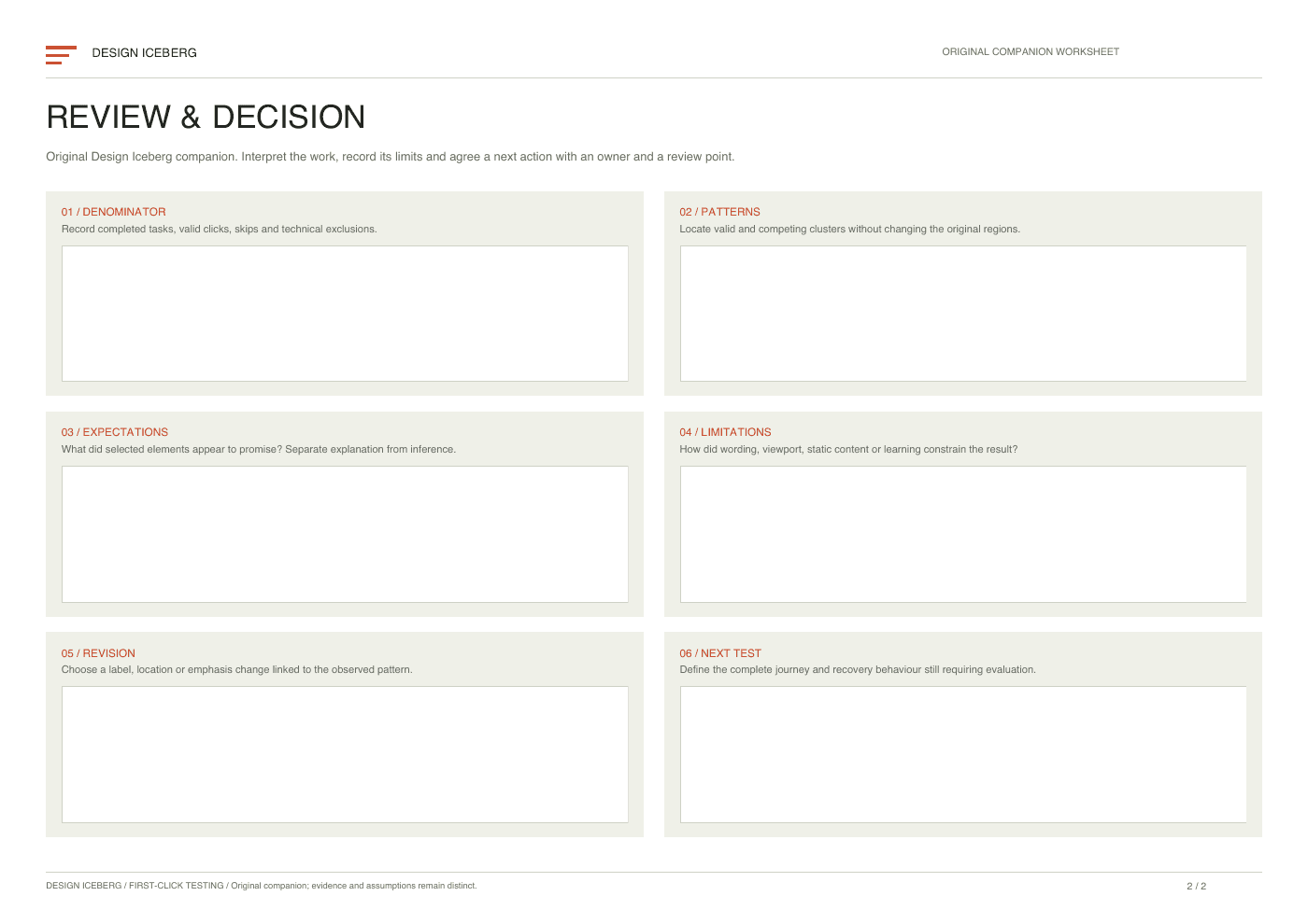
First-Click Testing companion worksheet
The original two page worksheet supports task planning and click review. Document valid regions before collection and separate initial choices from complete outcomes. A tool or observed session captures clicks.

Practical tips
Keep the exact task, stimulus and region definitions together.
Inspect competing click clusters alongside valid routes.
Allow a participant to skip when no route seems suitable.
Common mistakes
Repeating the target label in the task instruction.
Reporting first click validity as complete task success.
Expanding valid regions after seeing an inconvenient pattern.
What you’ll get
A bounded account of how people expect to begin a task. Use it to improve the entry point, then test the journey that follows before claiming the task is usable.