01 / UNDERSTAND
What are wireframes?
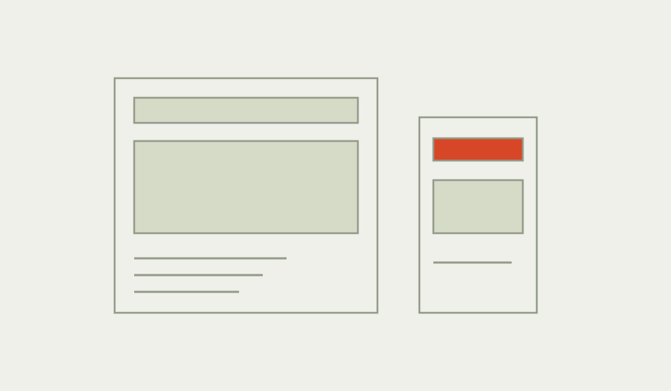
Wireframes represent the structure of an interface: the content people encounter, the actions available and the hierarchy connecting them. They can be sketched or digital, with enough detail to explore a specific design question.
Their value is making interaction decisions visible before visual refinement. A wireframe can remain static, while a prototype adds behaviour or a simulated sequence. Neither needs to look finished to support useful discussion.
Why use Wireframes?
Abstract requirements can conceal disagreements about what a person needs to know before acting. Wireframes turn those assumptions into a concrete arrangement. They also make it easier to compare alternatives without spending equal effort on typography, imagery and polished components.
When to use it
USE IT WHEN
The team needs to explore content hierarchy or task structure.
Several interface approaches should be compared before detailed design.
Important error, empty or confirmation states are still undefined.
When to choose another method
Use User Interviews when the task and context are not understood.
Use Storyboarding to explore an experience beyond the screen.
Use a more functional prototype when timing, input behaviour or accessibility interactions are central to the question.
What you’ll need
Define the user task and entry point. Gather realistic labels, content lengths, data examples and platform constraints. Identify the states that matter for the decision. Agree what the wireframes can demonstrate and what remains outside their fidelity, especially keyboard, screen reader and dynamic behaviour.
What the method needs
Keep the elements that help answer your question and support a decision.
The outcome the interface should help someone achieve.
What must be understood first and what can be secondary.
Available choices and their expected consequences.
Initial, changed, empty, error and completion conditions where relevant.
How order and grouping adapt to available space.
Rules and uncertainties that a static screen cannot explain alone.
02 / PUT IT INTO PRACTICE
How to create wireframes for a real task
Keep evidence and assumptions distinct. Revisit your work when new information changes your understanding.
01
Choose the question
Name the structural decision to explore rather than drawing every screen immediately.
Can someone compare a collection time with the location before confirming?
02
Sketch alternatives
Try materially different groupings or sequences with realistic content.
Compare a single review screen with a separate confirmation step.
03
Make the primary action clear
Show what information supports the action and what happens afterwards.
Reserve item is different from submitting an expression of interest.
04
Draw consequential states
Include a failure or changed condition that could alter the task.
Show what happens when the selected slot is no longer available.
05
Adapt the structure
Check narrow and wide layouts through reading order and action priority.
Keep the selection summary meaningful when columns become one sequence.
06
Review and test
Use critique or a walkthrough to identify assumptions, then test an appropriate prototype with people.
Do not infer that a static arrangement proves the complete interaction is usable.
Example: reserving an item when availability changes
Illustrative design: an equipment library needs a reservation flow. The first wireframe shows the item, location and collection slot before a Reserve item action. A second state shows that the chosen slot has become unavailable. A third confirms the alternative slot after the person selects it.
The error state keeps the item context and previously entered information visible. It asks for one new choice rather than restarting the whole task. On a narrow screen, the summary appears before the action so the person can check the commitment.
The next prototype would test whether people understand what has and has not been reserved. These screens are original examples, not an evaluated design or evidence of a successful service.

03 / BELOW THE SURFACE
Below the surface: empty boxes postpone decisions
A low detail drawing can still need high detail thinking.
CONTENT
Which words change the decision?
Use realistic labels and constraints.
STATE
What happens when the expected path fails?
Preserve useful context and recovery choices.
FIDELITY
What must be precise for this question?
Spend detail where it enables learning.
A rectangle labelled content hides the length, vocabulary and conditions that give an interface its meaning. Replacing it with realistic material may reveal that two options cannot be compared or that an essential qualification appears too late. Reduce decorative detail, not the detail needed for the question.
For the reservation flow, the difference between requested and confirmed must be explicit even in a rough sketch. By contrast, the final illustration style can remain unresolved.
This editorial check treats fidelity as selective. Add enough precision to expose the decision, then stop. A polished mockup with vague content can be less informative than a rough screen with accurate states, consequences and language.
Wireframes companion worksheet
The two page worksheet provides three screen spaces for a task and its changing states, followed by a responsive and interaction review. It supports typed notes or printed sketches and does not prescribe a particular interface layout.


Practical tips
Use realistic content early enough to challenge the structure.
Keep alternative arrangements until the decision is understood.
Common mistakes
Drawing only the successful path.
Shrinking a desktop composition without reconsidering reading order.
Mistaking static review for proof of accessible behaviour.
What you’ll get
A structural proposal with important assumptions and states exposed. Turn the uncertain interactions into a suitable prototype and revise the wireframes as evidence changes the design.